
The Logo, etc.

This section contains explanations of one or two features of the site some visitors might find puzzling:
- What do I mean by 'Outliers', referred to on the Home Page?
- Why is the domain name extension dot org and not dot com?
- What is the significance of the logo pattern?
"OUTLIERS"
In scientific data, some values can fall far away from the main body of observations, and are commonly called 'outliers'. Very often they are disregarded as the result of mistakes of various kinds. The same term is sometimes used of researchers or thinkers whose views lie outside the mainstream. To give a real example, I once crossed swords with a senior civil servant attached to the government's Climate Change Committee. I questioned the consistency of some of the Committee's claims and he challenged me to substantiate my views. In support I cited the work of Kevin Anderson from the Tyndall Centre in Manchester. "Kevin Anderson", the official replied with a barely-concealed sneer, "is an outlier".
Well, if Kevin Anderson is an outlier, I am happy to be one too. We remain true to reason and evidence, and if they lead us into the wilderness, that's where you'll find us.
The same compulsion to state the physical truth sometimes gets us into trouble with standard green ideas, simply because many of them are not well thought-out, and have become canonical simply because they were the first thing we thought of back in the sixties when we were inventing the whole notion, or just because they sort of feel right, at least to some people.
DOT ORG
A web site needs a domain name, and private sites typically use the extension ".com" or in Britain, ".co.uk". However the dot com extension suggests a commercial orientation that is not my intention. I am much more like a one-person NGO than a private enterprise. It seemed more appropriate to use ".org". And who knows, others might join me.
THE LOGO
The two lines in the logo represent two contrasting development trajectories. The red line overshoots dramatically and requires an uncomfortable readjustment to get back on track. The green line represents a more rational approach to long-term sustainable flourishing, with a small but manageable overshoot. Most wealthy countries are following the red pattern. Many poorer ones still have a chance to follow the green pattern.
For the truly curious, here is a more exhaustive explanation:
THE MEANING OF THE LOGO PATTERN
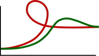
There are two curves. They represent points on a dynamic graph representing the relationship between Stuff (vertical axis) and the Quality of Life (horizontal axis).
We could also describe the vertical axis as Standard of Living, Level of Consumption, or GDP.
The horizontal axis could also be termed sustainability or Genuine Progress or well-being or Happiness.
The curves can be thought of as trajectories running from left to right, or as specimen ‘modernisation cycles’.

Consider first the red curve. There is much Genuine Progress to be made, and it could be said that humanity has hardly started. It is undeniable that a high quality of life cannot be achieved in conditions of extreme poverty. Hence at the outset (left hand side) the most rational and ‘natural’ thing to do is to increase the Standard of Living, represented by the rising limb at bottom left. This rapidly delivers a wide range of physical conditions necessary for a high quality of life, among them basic medical care, adequate food, education, clean water, sanitation, infrastructure such as roads, artificial energy sources, family planning, communications, cheap domestic goods and so on.
This process is so effective that it comes to be widely believed that increased material provision will always continue to generate greater happiness. The illusion is compounded in many ways, for example by the fact that richer citizens are often happier because they have higher status, and indeed one way to get happier is to achieve higher status by getting richer; but it is not so much the extra wealth as the higher status that causes the effect. Status is a ‘positional’ good, it is only gained at someone else’s expense: the average increase in welfare is zero. Still the illusion persists.
It is widely agreed, even among economists, that the response of welfare to increased wealth weakens, that it takes more and more material wealth to create further increases in experienced well-being. More radically, some evidence has been found that the increase of happiness can actually go into reverse with higher levels of GDP. This might have many causes, but it must be admitted that rapidly-changing, hyper-modern consumption-based societies have not been tried before. Clearly they suit some, but might not be the best pattern for most. Whether the level of life-satisfaction is indeed declining, can be debated, but we do observe risks to sustainability, and this threatens well-being very fundamentally in the long run. As the GDP rises ‘overdrafts’ are drawn on the ecosystem services of the planet and these gradually tighten the screws relating to large-scale risks, even amidst vast material wealth.
This is represented graphically by the vertical part of the graph gradually turning back on itself: greater material throughput starts to have a negative, counterproductive effect, on average. That is not to say that some individuals, groups, classes or whole nations, cannot temporarily maintain an illusion of progress by avoiding malign effects in various ways, often by displacing them elsewhere or by cleverly ‘living in the cracks’ as it were.
The graph suggests that sooner or later these counterproductive forces will be understood; the habitual pressure for increased material throughput is relaxed; and a rational retrenchment undertaken, along the lines suggested by many theorists of ‘sustainable consumption’. A moderate, steady-state economy is embraced, represented by the right-hand limb of the curve, beyond the loop. This seeks greater well-being and environmental quality using a steady level of material throughput. It is not a return to poverty, but an advance into what Tim Jackson has shrewdly called ‘prosperity without growth’.

The second curve represents what might have happened had we known better. And indeed, we now do, and it is the pattern we should encourage in every possible way for newly-modernising economies. As before, material growth is initially rapid, then slows down as the basic material infrastructure is completed. There might well be an element of ‘overshoot’ because the forces of material consumption are extremely strong: wealthy elites tend to favour them and the masses follow the elites.
But there is no need to go round the whole negative loop: it is far more rational to go straight for the long term sustainable trajectory, perhaps with a small overshoot, representing initial investment in physical infrastructure.
The logo contrasts these two trajectories simply by putting them together:
